Deconstructing pictures of JOBS
26 Jan 2013 | in Steve Jobs news

Now that I’ve covered most of my thoughts on the independent Steve Jobs biopic JOBS, whose premiere is today at Sundance Film Festival, it’s time to cover form i.e. production values.
Let’s review the official pictures that we’ve seen emerge from the film’s promotional campaign.
The first picture was that of Ashton Kutcher as Steve Jobs sitting on his desk:
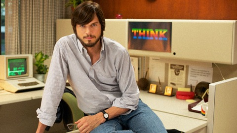
Which was trying to reproduce the below picture from 1981:
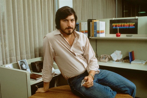
Most people here would first see a striking resemblance between the two men. And I have to say, it’s really well done indeed. At a quick glance, they do look a lot alike, and it becomes obvious why Kutcher was picked to play the part of young Steve. But of course, being the obsessive-compulsive type with those pictures of Steve Jobs, I couldn’t help but notice a few things:
1. Physical build. The two men certainly have some things in common. But Kutcher’s build is very different from Jobs’s. Jobs was very wiry when he was young (in his hippie, fasting days especially), and in the mid-1980s, but he put on some weight at various points in his life. Not that he ate too much fat, of course; but probably more because he, like your fellow webmaster, was more into work than into sports. You can tell that in the picture above; and you can tell that Kutcher used to be a model, too. Basically, I wonder if Kutcher’s very athletic build will be credible as the impersonation of SJ on the big screen. Noah Wyle was better suited in that regard.
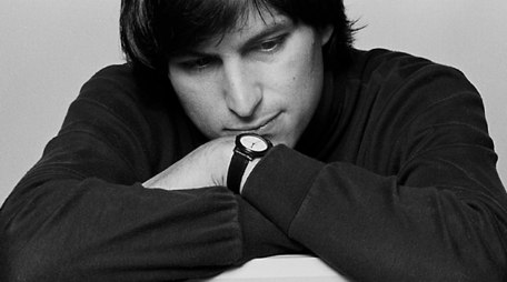
2. The watch. Look closely. In those days, Steve was a young millionaire, and showed off a little with his BMW motorcycle and his, yes, gold watch (after all, it was the 1980s). The watch that Kutcher wears is actually not bad, because SJ owned one very similar —only a few years later. So we’re dealing with a little anachronism here. Here is an example from 1984 that proves it:
3. The THINK poster. I would have been surprised if they had gotten that one right. But it’s the first thing that jumped to my eyes when I saw the picture of Kutcher. You see, that poster was not random. Its history was actually very well documented by Jef Raskin’s nephew —it is a variant of the Apple Syntax poster from 1980 (link from the Wayback machine). The original one featured Pascal syntax tips, and Steve Jobs was directly involved in its design. The version on his desk was using the same type as the Pascal header of the poster (3D letters with the Apple rainbow colors), applied to the IBM motto, THINK.
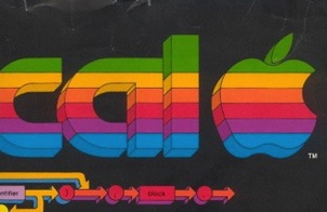
Unfortunately, the production crew of JOBS seemed to have bad eyes and to lack this information, as the type on their THINK poster seems to be dead flat.
My verdict:
Historical accuracy rating: 8/10
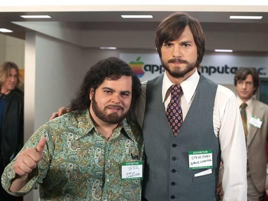
The second picture released by the JOBS team was one of the co-founders at the West Coast Computer Faire of April 1977:
And, for context, two photos from the 1977 faire:
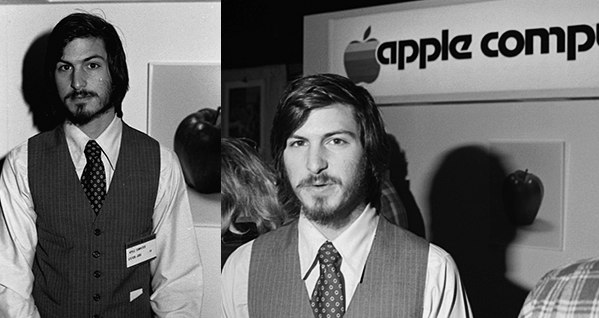
Steve Jobs was actually wearing his first suit that day, after the advice of Regis McKenna and Mike Markkula. I have very little to say here, the resemblance is striking and the costumes almost identical. (The same can’t be said of Woz though). Of course, I did find a couple things to complain about 🙂
1. The badge. A blowup of both pictures will get my point across:
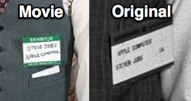
You might think I am too harsh with the movie, but this is actually non trivial. The West Coast Computer Faire was actually Apple’s grand entry into the personal computing market, the first time they were ever considered seriously. And McKenna was instrumental in getting the young scruffy Steves to look like businessmen on that day. So having handwritten, diagonal names on their badges is actually far from the truth of what that show was. In addition, Jobs’s first name on the badge was “Steven”, not “Steve” (I’ll admit I’m picky with that one).
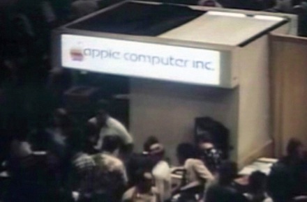
2. The booth. This is not about Steve, but the Apple booth, but again a small misconception on the importance of the West Coast Computer Faire for Apple. The movie makers couldn’t have guessed it from the black and white pictures (since they didn’t ask your fellow webmaster for advice) but that booth was actually lit by neon lights to look serious and attract visitors. Markkula put up heavy money for this, for a startup. Check this out:
3. The hair. Steve’s was a lot dirtier 😉
Historical accuracy rating: 9/10
I’d be interested to know what you guys think of this. I must say I was a little disappointed. With the great production values and all this talk of a ‘wow’ performance from Kutcher, I was actually expecting something close to the reality of Steve’s youth. That’s not what I saw in this clip.
Where do I start?
- the weird, forced intonations. “That changes e-ve-ry-th-in'”. Steve spoke fast, especially in those days. And he certainly didn’t speak to Woz the way he did keynotes in the 2000s;
- the depiction of Wozniak as basically a corporate stooge, in a suit, saying “Hi Charlene” to a colleague. He did like the comfort of a salary from working at HP, but I don’t think anyone could say Woz was the corporate type;
- the exchange on “the operating system” as if the term was new and coined by Wozniak. Yes, seeing what you typed on a keyboard on a TV screen was extraordinary. But this had nothing to do with the expression “operating system” which had been around for a good ten years then. As an example, Gary Kildall’s popular CP/M had been developed in 1973, three years before the Apple I…
- “nobody wants to buy a computer”… coming from Woz? It’s true that the idea of selling was stranger to him. But certainly not the idea of personal computing, since he was so familiar with it after attending the Homebrew meetings, where it was pioneered.
Woz actually confirmed what I felt in writing to several blogs, starting with Gizmodo, I quote:
Totally wrong. Personalities and where the ideas of computers affecting society did not come from Jobs. They inspired me and were widely spoken at the Homebrew Computer Club. Steve came back from Oregon and came to a club meeting and didn’t start talking about this great social impact. His idea was to make a $20 PC board and sell it for $40 to help people at the club build the computer I’d given away. Steve came from selling surplus parts at HalTed he always saw a way to make a quick buck off my designs (this was the 5th time).
The lofty talk came much further down the line.
I never looked like a professional. We were both kids. Our relationship was so different than what was portrayed. I’m embarrassed but if the movie is fun and entertaining, all the better.
As he says:
It’s only one clip. The movie should be very popular and I hope it’s entertaining. It may be very correct, as well. This is only one clip. But you’ll see the direction they are slanting the movie in, just by the dialog style of this script.
I hope he’s right.
Historical accuracy rating: 4/10
tres bon article!
Tu devrais écrire à Woz, il te repondra surement.
JB
Steve Jobs was a great man. I had treasured everything in him like no other before, I was saw in him such a hard work man, i love this guy!. Rest in Peace Steve. MAy all work may teach us to be a better person ever.
thank you man.
Excited about the movie! so excited i did a drawing of Steve Jobs
http://www.ebay.com/itm/I-Did-It-My-Way-Original-Steve-Jobs-Painting-By-Armando-Renteria-No-Reserve-/170991521329?pt=Art_Paintings&hash=item27cfe38e31
So… it was kind of strange that just a few days after Mr. Jobs passed away, i was faxed a copy of his Quitclaim Deed and Grant deed to my office, of Course accidental i am sure….Since i have nothing to do with any Escrow transactions….. He was a Great man and kinda neat to have these documents.
Well, the Jobs movie has been out for a while… I thought it was OK. Not bad. Not great. Just OK. Which isn’t what Steve deserves, but oh well. Kutcher does very well in it. But the script needs help.
The time period covered isn’t enough. It’s the same as in Pirates of Silicon Valley, yet somehow the movie accomplishes less, even though it has more time and more budget. No Pixar. No NeXT. No Blue Box. Since I’m a Steve Jobs superfan, I know what’s missing. But the average viewer has no idea.
The Jobs movie also kicks Jef Raskin in the balls. That’s uncalled for. Even a Steve fan like me knows Jef deserved better.